Archive
AI “Explainer” Videos
Did you try the Grok or Gemini prompt at the end of the last post on “AI Generated Infographics“? Did you compare the output of the two different AI services? If so, you probably noticed slight differences in the results.
This happens because even a well-crafted prompt still gives the AI a bit of freedom in a few critical areas, including:
- Data Sources – Whether it relies on primary data or supplements it with multiple sources.
- Calculation Methods – How it determines each daily data point. The AI might simply take the last (closing) value of the day, or it might use one of several averaging techniques to create a representative daily figure.
If you spotted these small variations from identical prompts, you’re seeing a perfect example of the difference between casual prompting and the rigorous prompt engineering we covered in our earlier article, Advanced AI Prompts.differences between casual prompts and the rigorous prompt engineering described in the earlier “Advanced AI Prompts” article!
Now, let’s add another “power tool” to our AI toolkit.
Take a look at this video produced with HeyGen.ai. While AI avatars can still have subtle “tells” that reveal a digital hand behind the scenes, they are becoming incredibly popular thanks to several clear advantages:
- Scripts are read exactly as written — no editing needed for speech patterns or unnatural behaviors.
- Fully automated production — once the script is ready, the video is generated automatically. The AI can even help refine the script from your initial draft or core idea.
- No studio required — skip the set, quiet recording room, special lighting, and all the usual production hassle.
Here is our HeyGen.ai avatar presenting the same “Sharpe Ratio” information from the last article on “AI Generated Infographics“:
For Education Only! Not Investment Advice!
*This article was researched and composed with the help of GROK AI!
*The Infographics were generated in a two step process. A Draft graphic in Grok was refined into the Infographic in this article by Google’s Gemini Pro.
The Power Of AI Generated Infographics*
For Education Only! Not Investment Advice!
The Power of AI-Generated Visuals: Demystifying the Sharpe Ratio
One very useful benefit of AI is its ability to generate powerful visuals that explain complex technical ideas and relationships. Every organization needs to master, share, teach and sustain the knowledge of their particular industry. Ask your AI to create an “Infographic” and watch it turn dry numbers into compelling, easy-to-understand stories.
Don’t be intimidated by the detailed information in these visual aids. Think of them as “reference cards” for the concepts that they present.
Look at these three excellent sample infographics explaining an important concept in investing: the Sharpe Ratio.
The Sharpe Ratio
The Sharpe Ratio, developed by Nobel laureate William F. Sharpe, is a powerful tool that measures an investment’s risk-adjusted performance. It answers a simple but crucial question: Are the extra returns you’re earning worth the additional risk you’re taking?
This “signal to noise” formula is:
\text{Sharpe Ratio} = \frac{\text{Portfolio Return} - \text{Risk-Free Rate}}{\text{Standard Deviation of Portfolio's Excess Return}}A higher Sharpe Ratio means better compensation per unit of risk. A ratio of zero means you’re not being rewarded for the volatility you’re taking, while negative values signal outright destruction of value relative to a risk-free asset like Treasury bills.
** Note that these formulas are backward looking, not projections of future behavior **
AI has the remarkable ability to transform this abstract formula into crystal-clear, instantly understandable stories. Here are three excellent AI-generated examples:
Figure 1: Sharpe Ratio Comparison – Risk-Adjusted Performance
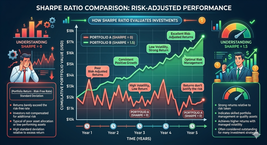
This first visual compares two hypothetical portfolios over five years. Portfolio A (Sharpe = 0, shown in red) zigzags wildly with frequent drawdowns, delivering returns that barely exceed the risk-free rate — classic “poor risk-adjusted returns.” Portfolio B (Sharpe = 1.5, shown in green) climbs steadily with far less volatility, featuring labels such as “Consistent Positive Growth,” “Low Volatility, Strong Return,” and “Excellent Risk-Adjusted Returns.” The side panels reinforce the lesson: a Sharpe of 0 means investors are not being compensated for risk, while a Sharpe of 1.5 signals skilled portfolio management and quality assets that achieve higher returns with controlled volatility.
Figure 2: The Sharpe Ratio – Your Measure of Performance Consistency
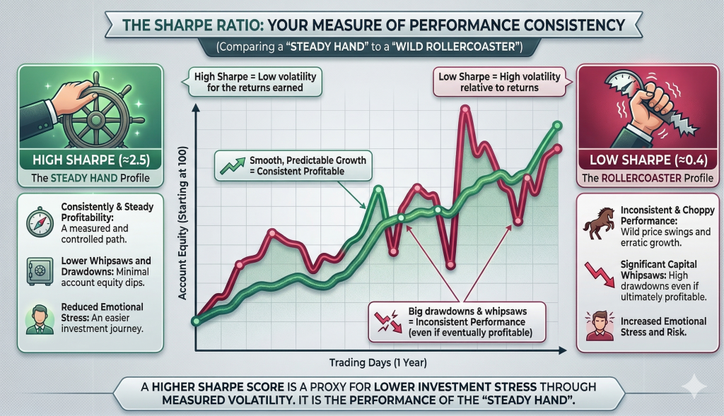
The second infographic shifts the focus from raw numbers to the emotional reality of investing. It contrasts the “Steady Hand” profile (High Sharpe ≈ 2.5) against the “Rollercoaster” profile (Low Sharpe ≈ 0.4). The green line shows smooth, predictable growth with minimal drawdowns and reduced emotional stress. The red line whipsaws with big drawdowns, erratic swings, and high stress — even when it eventually ends up profitable. The takeaway is clear: a higher Sharpe Ratio is a proxy for lower investment stress through measured volatility. It represents the performance of the “Steady Hand.”
Figure 3: The Sharpe Ratio Performance Scorecard
This is a custom normalization for visualization purposes, not a standard financial metric.
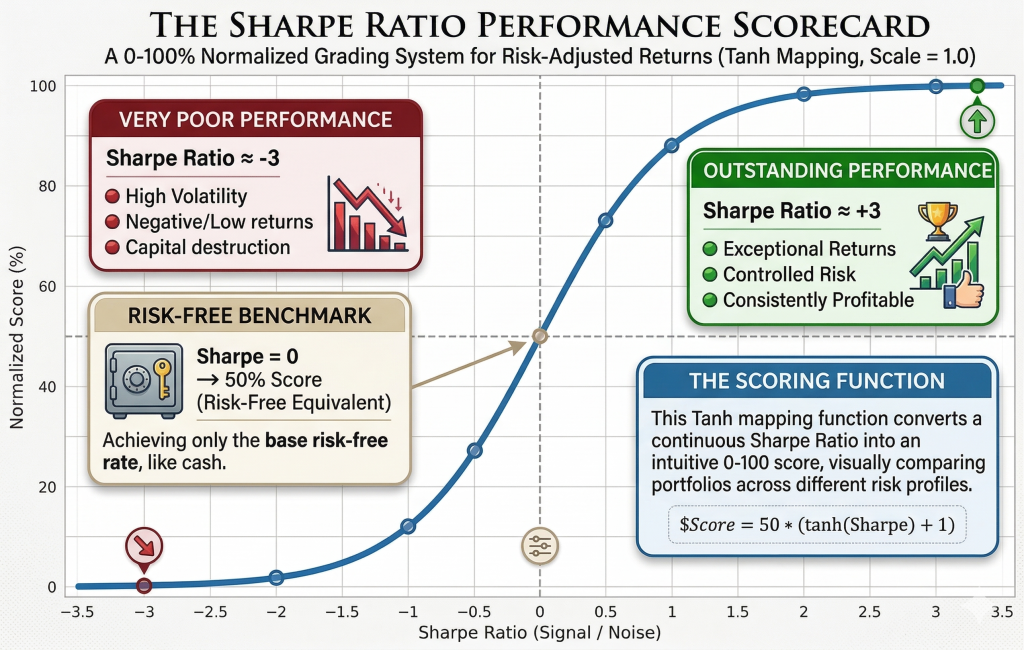
The third visual takes the concept one step further by converting any Sharpe Ratio into an intuitive 0–100 normalized score using a tanh mapping function:
\text{Score} = 50 \times (\tanh(\text{Sharpe}) + 1)On the left, a Sharpe of ≈ –3 earns a “Very Poor Performance” score near 0% — high volatility, negative returns, and capital destruction. At Sharpe = 0 the score is exactly 50% — the risk-free benchmark. On the right, a Sharpe of ≈ +3 pushes the score toward 100% — “Outstanding Performance” with exceptional returns, controlled risk, and consistent profitability. The smooth S-curve makes it instantly obvious where any portfolio lands on the spectrum.
Summary
These three visuals — generated in seconds by AI — turn a single mathematical ratio into a compelling narrative that anyone can grasp. They don’t just show data; they tell a powerful story about risk, reward, consistency, and peace of mind.
Of course, the Sharpe Ratio is not the only factor in making investment decisions. High-risk, high-reward ventures — such as disruptive startups and breakthrough technologies — often produce lower Sharpe scores due to their higher volatility. However, they also carry the potential to transform existing industries and create entirely new markets that were previously unimaginable.
In a world flooded with financial noise, AI’s ability to create such precise, beautiful, and educational graphics is more than a convenience — it’s a genuine superpower for clearer thinking and better investing decisions.
Exercise:
Upload these three images to Grok, Gemini, or your favorite LLM and ask:
“Compare Sharpe ratios of S&P 500 and NASDAQ 100 over one, three and five years. Use daily data. Use 3-month treasury as the risk-free rate. summarize the results in a concise table. Document the table with a footnote showing the start and end date for the five year data.”
Hint: You may be surprised by which index shows the better risk-adjusted performance over the last five years! There will also be slightly different answers between Grok, Gemini, ChatGPT.
For Education Only! Not Investment Advice!
*This article was researched and composed with the help of GROK AI!
*The Infographics were generated in a two step process. A Draft graphic in Grok was refined into the Infographic in this article by Google’s Gemini Pro.
eMail: Business.Services@oiweb.net